


As I get deeper into AI coding workflows, it’s become very clear how the nature of development work is changing. Much less typing, much more explaining. When every model can write flawless code in any language, our value as developers shifts from knowing the arcane ins and outs of syntax to knowing how to describe what we want with precision.
That may be bad news for folks who pride themselves on memorizing language quirks, but I’ve never thought the best measure of a developer was their knowledge of JavaScript minutiae. What matters is our ability to translate messy ideas into clear, actionable instructions - and in the age of AI coding, vague requirements just don’t cut it.
The Peanut Butter Sandwich Challenge
When I was in grade 3 or 4, our teacher gave us an assignment: explain to an alien how to make a peanut butter sandwich. Easy, I thought - I made them every day. But it quickly became clear this alien knew nothing about peanuts, or butter, or knives, or bread, or even what “spreading” was. The questions kept coming, and my “simple” instructions turned into a never-ending list of clarifications.
Coding with AI can feel the same way. Some things it understands instantly, in remarkable detail, and others - things that seem painfully obvious - it gets completely wrong. And more often than not, when it stumbles, the root cause isn’t the AI at all, but gaps or assumptions in my own explanation.
With that in mind, I decided to run an experiment: build the same new website feature twice - once from a deliberately vague product requirements document, and once from a clear, detailed one - and see how close I could get to a production-ready result with just one prompt.
The Feature
I threw around a few ideas before settling on a progress bar in the cart drawer showing how close a customer is to unlocking free shipping. It felt like the sweet spot - simple enough that Claude Code could probably build it in one go, but tricky enough to build by hand that a working version would actually be impressive.
First, I wrote the kind of product requirements doc (PRD) you might dash off between meetings:
As an ecom manager, I want to show customers how close they are to free shipping, to help increase AOV.

A/C

Given a user adds something to their cart

When the cart drawer opens

Then a message should show how close they are to free shipping

And it should look like the image below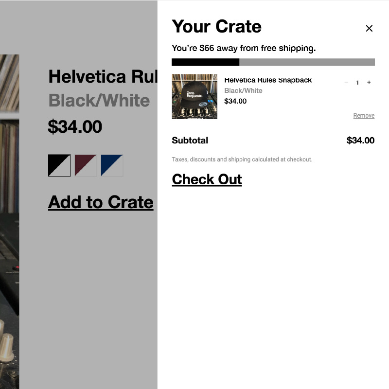
It took almost no time to write and felt like it would get the point across - but would it?
For the “good” PRD, I started with that same draft, then asked ChatGPT to improve it. I fed the output to Claude Code, asked it to review my CLAUDE.md file (which outlines project coding guidelines), and add any missing developer requirements. Ten or fifteen minutes later, after some editing, I had this:
Title:
Free Shipping Progress Indicator in Cart Drawer

Overview:
We want to improve conversion rates and average order value by displaying a visual progress bar in the cart drawer that shows how close customers are to qualifying for free shipping. This feature will create urgency and incentivize customers to add more items to reach the threshold, targeting a 10–15% increase in AOV for carts under $100.

User Story:
As a customer, I want to see how much more I need to spend to get free shipping, so that I’m motivated to add more items to my cart.

Acceptance Criteria:

Threshold Definition
- Free shipping threshold is $100 USD, configurable via theme settings.
- If the cart subtotal is equal to or greater than $100, the user qualifies for free shipping.

Indicator Display
- If subtotal < $100:
-- Show a horizontal progress bar in the cart drawer
-- Above the bar, show: “You’re $XX away from free shipping.”
-- Progress bar should visually reflect percentage progress (e.g., $34 subtotal = 34% progress).

- If subtotal ≥ $100:
-- Replace the progress bar with: “You’ve unlocked free shipping!”
-- Style this as celebratory (larger font, success green color) but maintain the site’s minimal aesthetic.

Location and Layout
- Place the indicator at the top of the cart drawer, above cart items.
- Should not interfere with the existing layout.

Design Reference
- Use the attached screenshot (two-prds-feature.jpg) for basic styling cues:
-- Black text on white background
-- Progress bar should use the brand’s grayscale palette
-- Use Helvetica Neue or system fallback sans-serif
-- Animate the progress bar smoothly when it updates

Responsiveness
- The bar and messaging should render properly on both mobile and desktop.
- Ensure the indicator does not overflow or overlap with other elements.

Technical Implementation
- Build as a modular component within our existing Theme 2.0 architecture
- Leverage the current cart drawer infrastructure and event system for real-time updates
- Make the threshold configurable through theme settings for A/B testing (e.g., $75 vs $100 vs $125)
- Support multi-currency for international markets
- Integrate with the existing build pipeline (Webpack/SCSS)
- Follow our standard patterns for cart interactions
- Support localization:
-- All user-facing text should be added to locales/en.default.json using namespaced keys like cart.free_shipping.*

Ensure strong performance:
- Lazy load the component
- Animate efficiently without blocking the main thread

Accessibility
- Include ARIA labels as needed
- Text must be screen-reader compatible
- Maintain WCAG AA-compliant color contrast
While it could still be improved, it definitely sounded more complete and polished - but would it actually lead to a better result?
First Test
I started things off by pasting this prompt into Claude Code:
Please build the feature in the attached image, here are the details:

[PRD 1] [Image]
Before I’d even finished jotting down my notes, less than five minutes later, the feature was built.
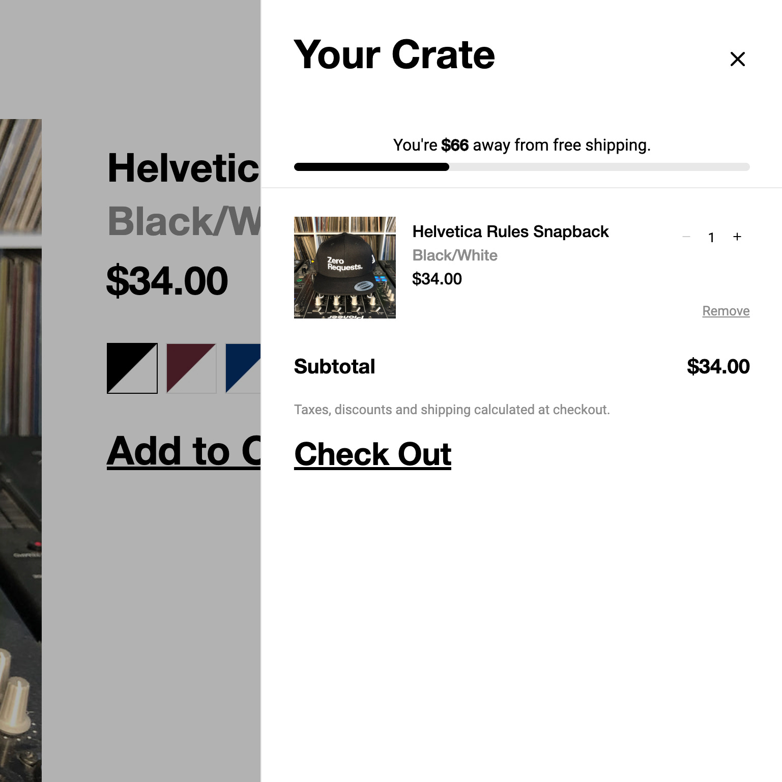
This was definitely better than I anticipated from a simple prompt, and the feature worked as expected. Adding or removing items from the cart updated the progress, and cart totals over the free shipping threshold triggered the success messaging.
On the downside, the UI did not resemble the design very closely, and the free shipping threshold amount was hard-coded into the React component for the cart. I was sure there were probably other issues I wasn’t spotting right away.
Second Test
For round two, I wanted to give Claude Code the best possible shot. I switched to a clean branch, created an implementation.md file in the theme with the full, detailed PRD, and dropped in my reference image. I like keeping these in the repo so they’re always available if context gets lost mid-task.
Then I gave it my prompt:
Please review @implementation.md and @two-prds-feature.jpg and build the feature.This time it took a bit longer to build - maybe twice as long - but it was still done in under ten minutes.
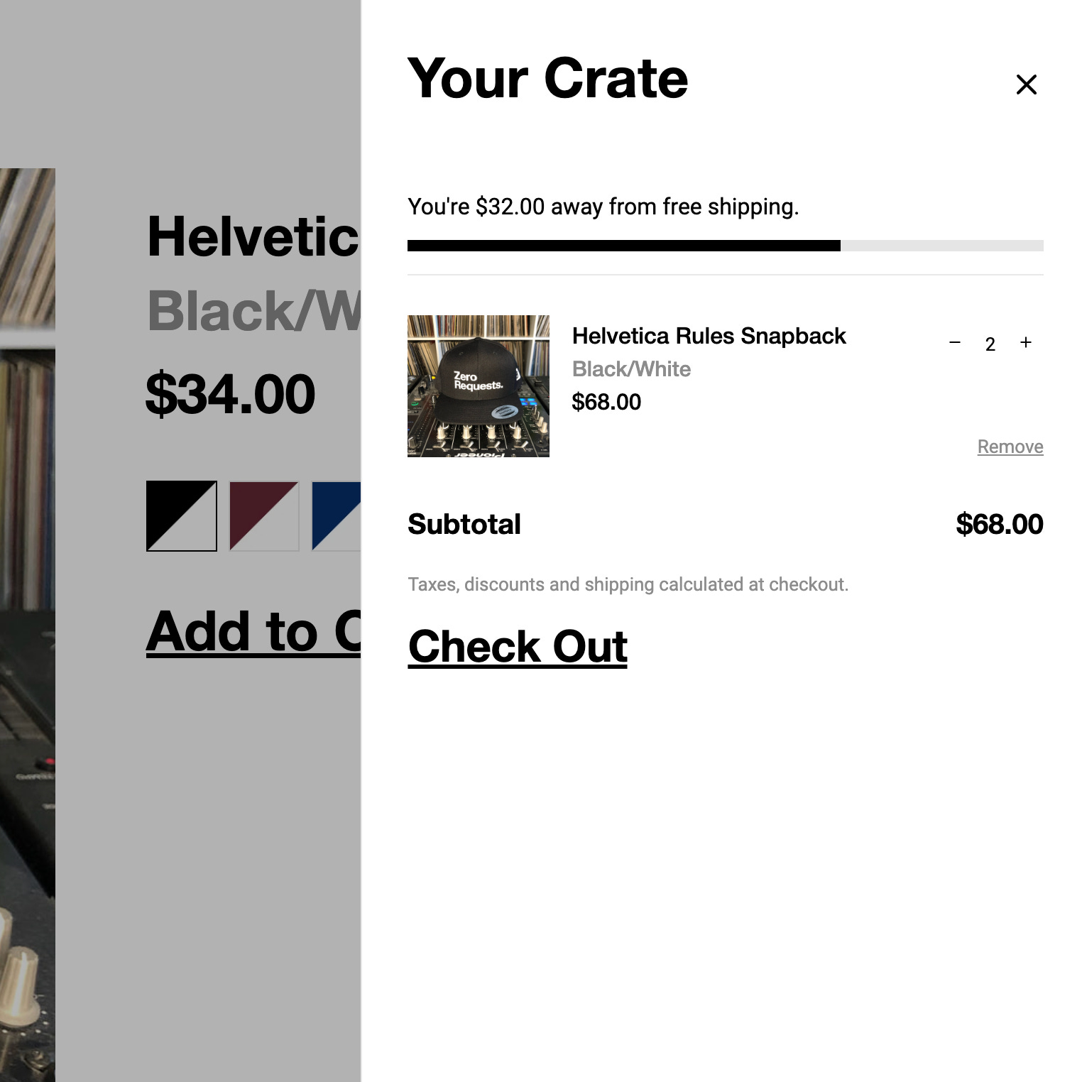
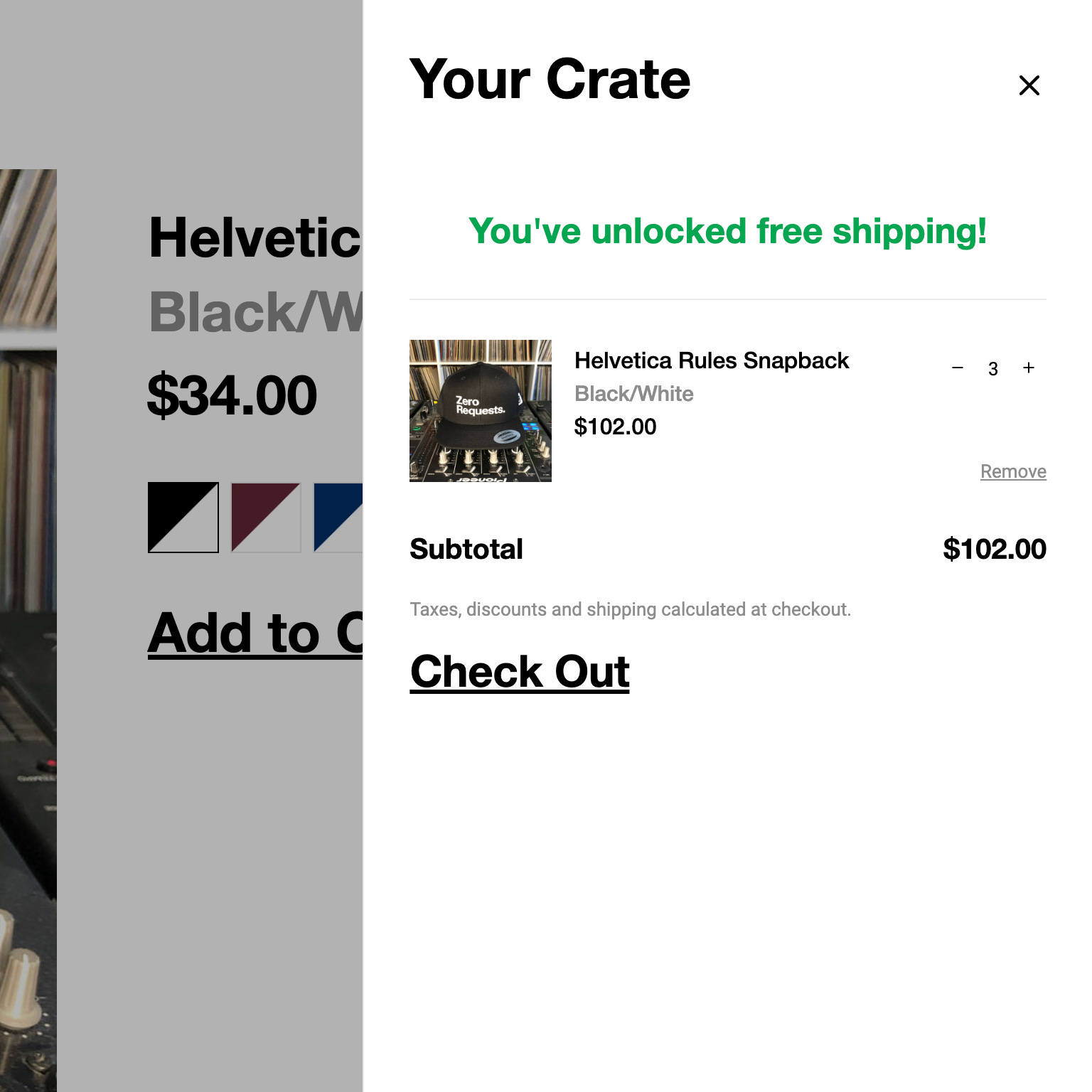
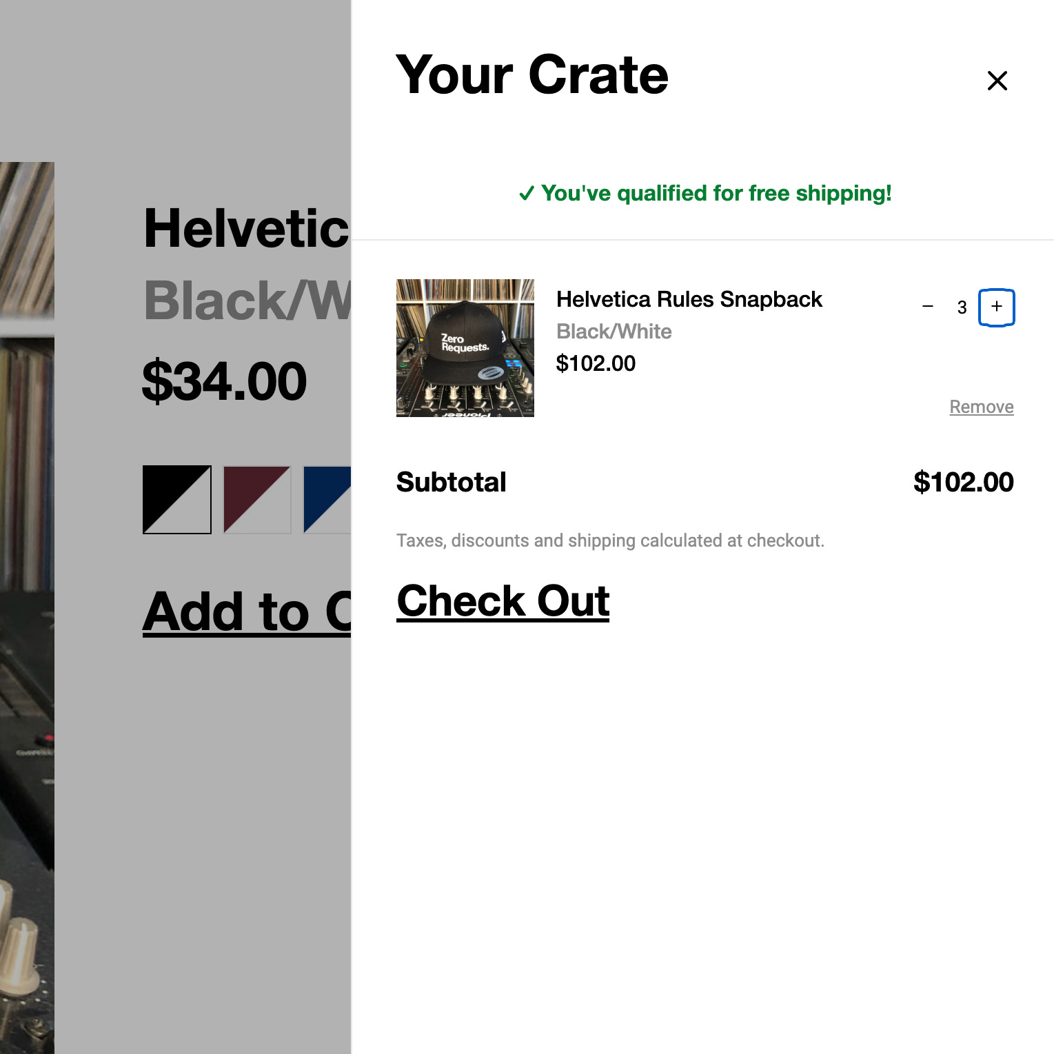
Visually, it didn’t look radically different from the first attempt. It was a bit slicker and closer to the design, but still included a few flourishes I hadn’t asked for, like a light border under the component. The success message styling was also slightly off, which was my fault for not providing a dedicated reference image for that state.
Functionally, though, the difference was clear. It performed just as well as the first build, but with extra polish: the free shipping threshold was added to section settings, translations replaced hard-coded text, and accessibility details like ARIA labels and proper contrast were already in place.
Comparison
To wrap up the experiment, I asked Claude Code to compare the committed changes between the two branches. The goal was to make the impact of a vague PRD vs a detailed one visible at a glance. Here is the high-level summary it came up with:
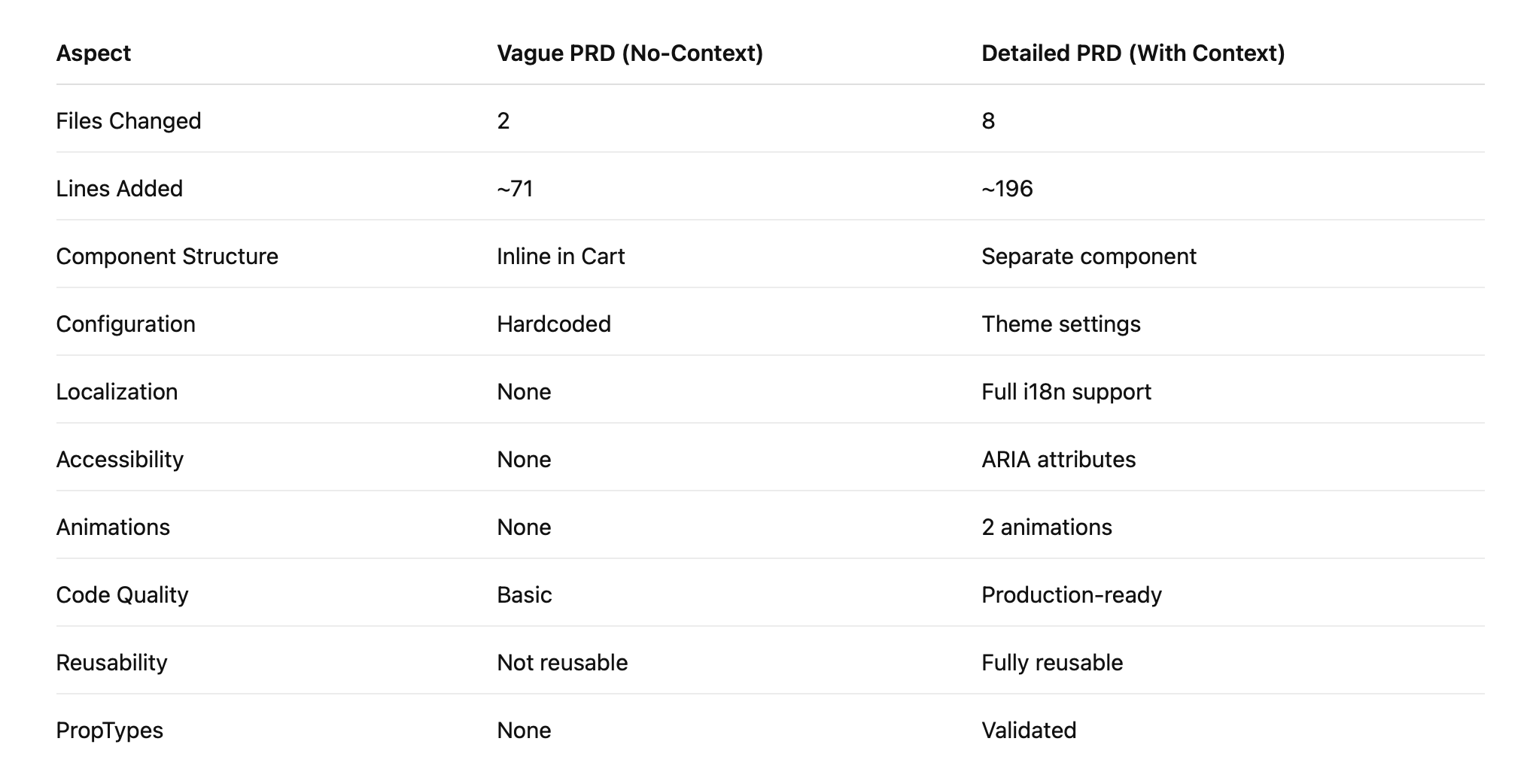
Even without diving into the code, you can see how much more complete and production-ready the second implementation became just by spending a few extra minutes improving the PRD. The difference in execution time for the build was negligible, but the difference in quality was not.
Conclusion
While neither feature was fully finished, attempt two was much closer. A few styling touch-ups and it would be ready to ship. I’ve seen developers ask, “Why not just code it yourself if you have to write a 1,000 word PRD anyway?” Fair question, but I’d argue the extra effort in the planning phase pays off. You get a better end product, faster, and save yourself time cleaning up later.
One burning question is, “How much time can you save coding with AI?” But I think the more important question is, “How much better can you build with AI?” If all we care about is getting phase one out the door, sure, it’s fast. But why stop there when you can also bake in phases two and three at the same time? We now have the luxury of previously unimaginable output. I’d rather spend that extra time building better products - and that means planning more, explaining more, and expecting more from the build.